Model
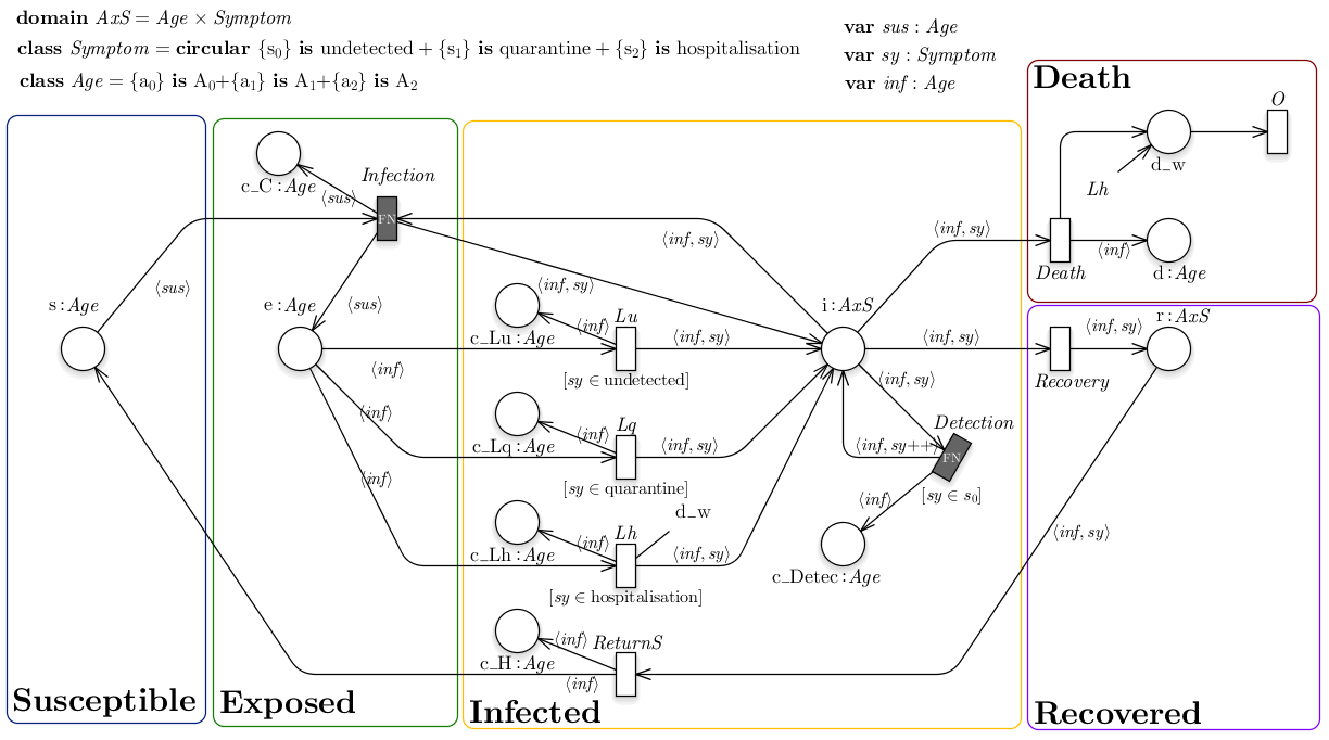
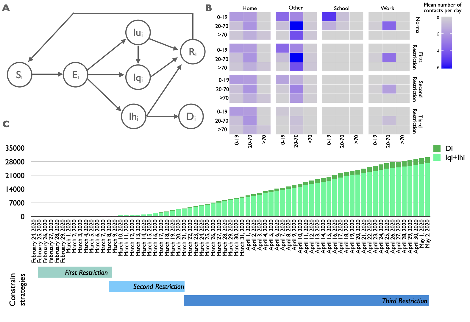
We propose an extended version of the SEIRS modeled exploiting the Petri Net formalism to account for the population age distribution, that was classified into three groups: young individuals 0-19 years, adults 20-69 years, old adults aged at least 70 years. The following figure shows:
- (A) The transmission flow diagram of our age-dependent SEIRS model, where the circles represent population partitions and the arcs describe the disease progression.
- (B) Age-specific and location-specific contact matrices. The intense of the color indicates higher propensity of making the contact.
- (C) Distribution of quarantine infected (Iq), hospitalized infected (Ih) and deaths (D) from February 24th to May 2nd. The control strategies are reported below the bar graph.
The population of the age class i is partitioned in the following seven compartments: (Si), (Ei), (Iu i), (Iq i), (Ih i), (Ri), (Di). With respect to the classical SEIRS model, we have added a transition from Iu i to Iq i to model the possibility to identify undetected cases and isolate them. In this way an individual in Iu i tested as positive to the SARS-CoV-2 swab will be moved in the quarantine regime, Iq i.
The force of infection adopted in the model is a time and age class dependent function and includes the following four terms:
- the infection rate, depending on the age classes of both the susceptible and the infected individuals who come into contact according to the contact matrix;
- the strength of governmental restriction defined through a time-depended step function, modeling the severity of the public restrictions;
- the compliance with the governmental restriction, reporting how effectively the population adheres to the restriction measures imposed by the Italian government. The higher the disease severity (i.e., the severity of the epidemic in terms of number of deaths and hospitalized individuals in the last 40 days), the better the population compliance;
- the compliance with individual-level measures, considering how different infection-control measures are properly adopted by the population.
A detailed description of the model (e.g., system of ordinary differential equations, parameters, etc) is reported in [1].
Results
The calibration phase was performed to fit the model outcomes with the surveillance Piedmont infection and death data (from February 24st to May 2nd) using squared error estimator via trajectory matching. Hence, a global optimization algorithm, based on (Yang Xiang et al. 2012), was exploited to estimate 13 model parameters characterized by a high uncertainty due to their difficulty of being empirically measured:
- three parameters represent the probability of infection for each age class,
- four parameters reflect the governmental action strength,
- one parameter describes the intensity of the population response,
- two parameters represent the death rate for the hospitalized patients,
- two parameters are the initial condition for the undetected and quarantine infected individuals,
- the remainder parameter represents the detection rate for the third age class starting from the 1s t April.
Consistently, Figure 2A and 2B show that the calibrated model is able to mimic consistently the observed infected and death cases (red line respectively). In details, Figure 2A reports the cumulative trend of the infected individuals in which the undetected infected are showed in orange, the quarantine infected in light blue, and hospitalized infected in blue. The purple line reports the cumulative trend of the undetected cases diagnosed by SARS-CoV-2 swab tests. Differently Figure 2B shows the cumulative trend of deaths. In both histograms the surveillance data are reported as red line. Similarly, in Figure 3 the infected individuals for each age class are shown.
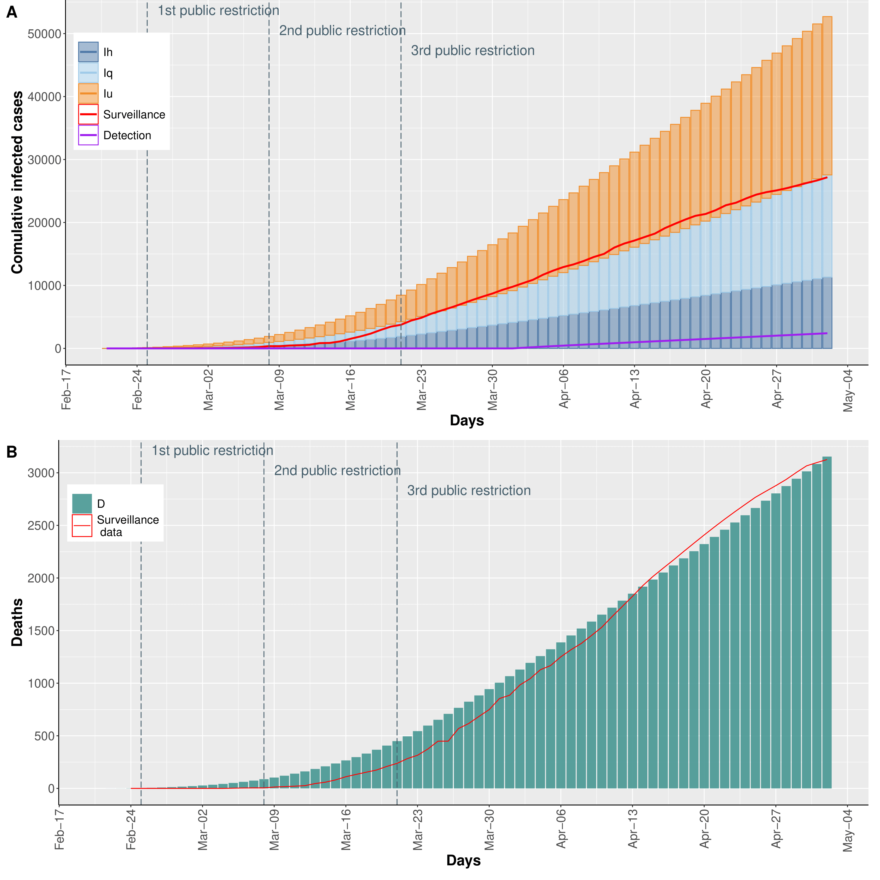
Fig.2) Number of (A) infected and (B) deceased individuals.
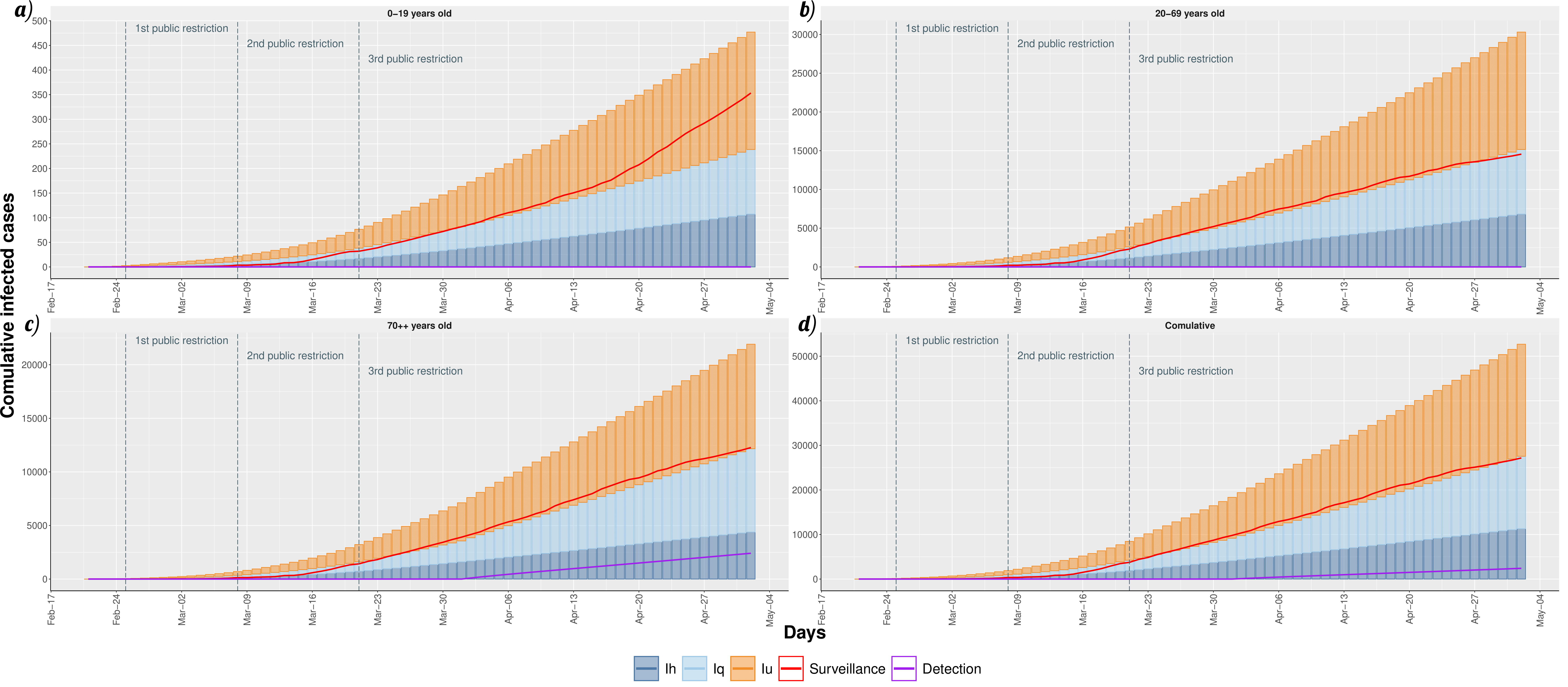
Fig.3) Number of infected individuals for each age class. The red curve represents the surveillance data, which does not account for undetected cases.
Studying the effects of the government control interventions.
Three scenarios are implemented. In the the model is calibrated to fit the surveillance data (yellow). In the the model extends the second restriction beyond March, 21s t without implementing the third restriction (blue). In the the model consider a higher population compliance to the third governmental restriction (green).
Fig.4) Stochastic simulation results reported as traces (on the left) and as density distributions (on the right).
COVID-19 epidemic containment strategies.
The daily evolution of infected individuals is shown varying on the columns the the efficacy of individual-level measures and on the rows the efficacy of community surveillance.
Fig.5) Pessimistic scenario in which the gradual reopening is not counterbalanced by any infection-control strategies
Fig.6) The daily evolution of infected individuals is shown varying on the columns the the efficacy of individual-level measures and on the rows the efficacy of community surveillance
Figure 5 shows the daily evolution of infected individuals computed by the stochastic simulation. The stacked bars report the undetected infected (orange), the quarantine infected (light blue), and hospitalized infected (blue). The red line shows the trend of the infected cases from surveillance data. The purple line reports the cumulative trend of the undetected cases diagnosed by SARS-CoV-2 swab tests. In Figure 6 we show the daily forecasts of the number of infected individuals with the efficacy of individual-level measures ranging from 0% to 60% on the columns (increasing by steps of 20%) and, on the rows, increasing capability (from 0% to 30%, by 10% steps) of identifying otherwise undetected infected individuals. These results are obtained as median value of 5000 traces for each scenario obtained from the stochastic simulation.
References
Pernice, S., M. Pennisi, G. Romano, A. Maglione, S. Cutrupi, F. Pappalardo, G. Balbo, M. Beccuti, F. Cordero, and R. A. Calogero. 2019. “A Computational Approach Based on the Colored Petri Net Formalism for Studying Multiple Sclerosis.” BMC Bioinformatics.
Yang Xiang, Sylvain Gubian, Brian Suomela, and Julia Hoeng. 2012. “Generalized Simulated Annealing for Efficient Global Optimization: The GenSA Package for R.” The R Journal. http://journal.r-project.org/.